WELLNESS TO WEB
FOREVER YOUNG JOURNEY
Introduction
In today’s crowded world of health and beauty services, standing out takes more than just offering great treatments—it takes building trust from the very first click.Forever Young Wellness, known for advanced weight loss and aesthetic treatments, wanted a website that reflected their warm, professional approach. While their previous site served a purpose, it didn’t fully capture the energy and care they bring to every client interaction. That’s where we stepped in. Our goal was to create a digital experience that felt just like their clinic—welcoming, easy to explore, and full of possibility.
Project Goals
- Establish Trust & Expertise
Forever Young Wellness needed a website that built trust—one that combined medical credibility with a warm, approachable tone. It had to highlight real results without overwhelming visitors with technical language. - Highlight Key Services
From weight loss programs to RF microneedling, the clinic offers a broad range of treatments. We aimed to present these services in an organized manner, using clear headings, icons, and concise explanations to help visitors quickly understand each offering. - Create a Seamless User Experience
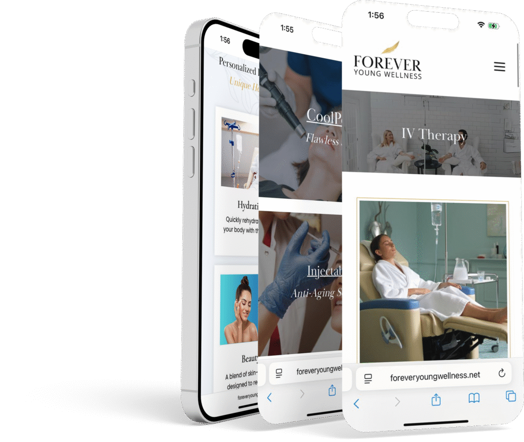
With potential clients often browsing on mobile devices, the site required a responsive design that remained visually appealing and easy to navigate across all screen sizes. Calls-to-action—like “Book an Appointment” or “Book Free Consultation”—needed to be prominently placed. - Turn Interest into Action
The goal wasn’t just to attract visitors—it was to help them take meaningful next steps. From simplified service descriptions to clear calls-to-action, every part of the site was designed to guide users toward booking a consultation or reaching out for more information. By creating a smooth, intuitive experience, the website transforms passive interest into real engagement and action.
Design & Development Approach
1. Modern, Inviting Aesthetic
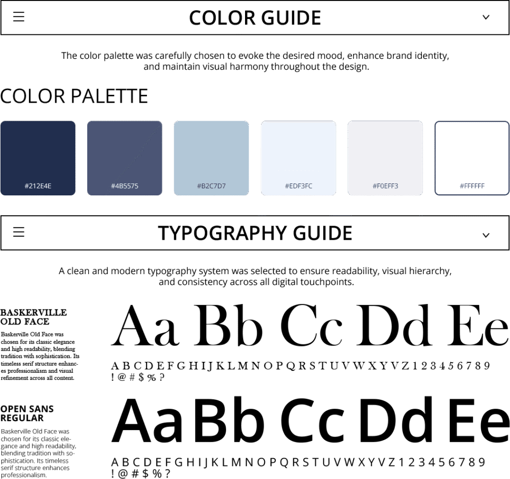
Color Palette
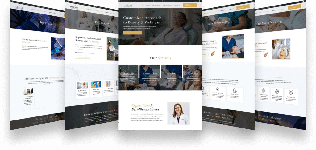
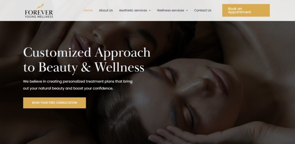
We chose a clean white background to convey professionalism, paired with gold accents for a touch of warmth and luxury. This subtle, spa-like aesthetic reflects the clinic’s focus on rejuvenation and care.
Typography
Sleek, sans-serif fonts convey a modern feel, while a tasteful serif typeface in headings adds a sophisticated flair. By maintaining consistent font sizes and spacing, we ensured that each page appears polished and easy to read.
Imagery
Photos showing real results—like before-and-afters and treatment sessions—help visitors see what to expect. We kept all the images soft and natural to match the calm, clean feel of the website’s gold and white design.
2. Service-Oriented Layout
RF Microneedling Highlight
Another dedicated section focuses on microneedling with radiofrequency. Visitors learn how this treatment “tightens and firms,” “reduces fine lines,” and “improves skin texture” through succinct bullet points and stylized icons. The design ensures that medical terminology is presented in user-friendly language, reflecting the clinic’s approachability.
Weight Management Emphasis
A video titled “Weight Loss Tips for Beginners” sits front and center on the homepage, sharing helpful advice right away. Paired with the bold headline “Revolutionize Your Weight Loss with Proven Solutions,” it quickly captures attention and highlights the clinic’s commitment to real, patient-focused results.
Clear Service Sections
To make exploring treatments easy, we organized the homepage into clear sections. One titled “Effortless Anti-Aging and Contouring Solutions” introduces services like wrinkle relaxers and fillers, with simple icons and short phrases like “Smooth fine lines” and “Restore volume” to help visitors quickly understand the benefits.


3. Strong Calls-to-Action
Strategic Button Placement
“Book an Appointment” and “Book Free Consultation” buttons are placed throughout the site, ensuring visitors never have to hunt for the next step. By using a gold accent color, these CTAs stand out against the white background, drawing the eye and prompting action.
Prominent Hero Section CTA
In the hero area, next to the weight loss video, a bright button invites users to schedule an appointment immediately—catering to those ready to commit after seeing the clinic’s offerings. This approach capitalizes on the site’s most valuable real estate, reinforcing the clinic’s conversion goals.
4. Engaging Content Strategy
Simplified Explanations
While Forever Young Wellness relies on advanced medical strategies, the website content breaks down these concepts into bite-sized pieces. Terms like “RF Microneedling” or “dermal fillers” are explained in layman’s language, ensuring potential clients understand the benefits and outcomes.
Bullet-Pointed Benefits
To make the site scannable, each service includes a list of bullet points highlighting key advantages—such as “Natural-looking results,” “Tightens and firms,” or “Fades acne scars.” This quick-reference format appeals to busy individuals, who can easily compare treatments without wading through dense paragraphs.
Video Integration
Embedding a short video in the hero section demonstrates Forever Young Wellness’s commitment to patient education. Whether it’s weight loss tips or an overview of a particular procedure, video content creates a personal connection and fosters trust.
5. Responsive & Accessible Design
Mobile-First Approach
Recognizing that many users research wellness options on the go, we employed a responsive grid system. Each section resizes smoothly, with service icons re-aligning for smaller screens, and text blocks adjusting to remain legible. The site’s navigation bar collapses into a mobile-friendly menu, keeping the user experience intuitive across devices.
ADA Considerations
To make the website accessible to everyone, we added descriptive alt text to all images, used clear labels for buttons and forms, and ensured strong color contrast throughout the design. These thoughtful details not only improve usability for all visitors—including those with visual or motor impairments—but also reflect Forever Young Wellness’s deep commitment to inclusive, patient-centered care. By prioritizing accessibility, we helped expand the clinic’s reach and enhance the overall user experience.
Key Website Features
- Hero Video & CTA
- A short “Weight Loss Tips for Beginners” video draws immediate attention.
- The adjacent “Book Your Appointment” button encourages immediate engagement.
- Effortless Anti-Aging & Contouring Section
- Clean iconography highlights benefits like wrinkle reduction and facial contouring.
- Minimal text with bullet points keeps the information digestible.
- RF Microneedling Highlights
- Icons represent each benefit: tightening, wrinkle reduction, skin texture improvement, and scar fading.
- “Book Free Consultation” CTA offers a low-commitment entry point for curious visitors.
- Dynamic, Gold-Accented Buttons
- Repeated strategically throughout the site, ensuring visitors can schedule an appointment whenever they’re ready.
- Google Maps Integration
- A map snippet or embedded address helps clients find the clinic’s location easily, reducing friction for in-person appointments.
- Testimonial or Before-and-After Potential (Planned Expansion)
- Although not fully implemented at launch, the site structure can accommodate patient testimonials or before-and-after galleries, offering social proof for prospective clients.
Results & Impact
Enhanced Brand Perception
The new website brings Forever Young Wellness’s identity to life, striking the perfect balance between professionalism and warmth. From the moment visitors land on the homepage, they’re met with a modern, thoughtfully designed layout that feels both high-end and welcoming. Gold accents add a subtle touch of luxury, while clean, refined typography keeps everything feeling approachable and easy to read. Every visual element—from the color palette to the page flow—was chosen to reflect the clinic’s core promise: delivering premium aesthetic and weight management services in a supportive, patient-first environment. It’s a space that feels trustworthy, polished, and deeply personal—just like the care clients receive in person.
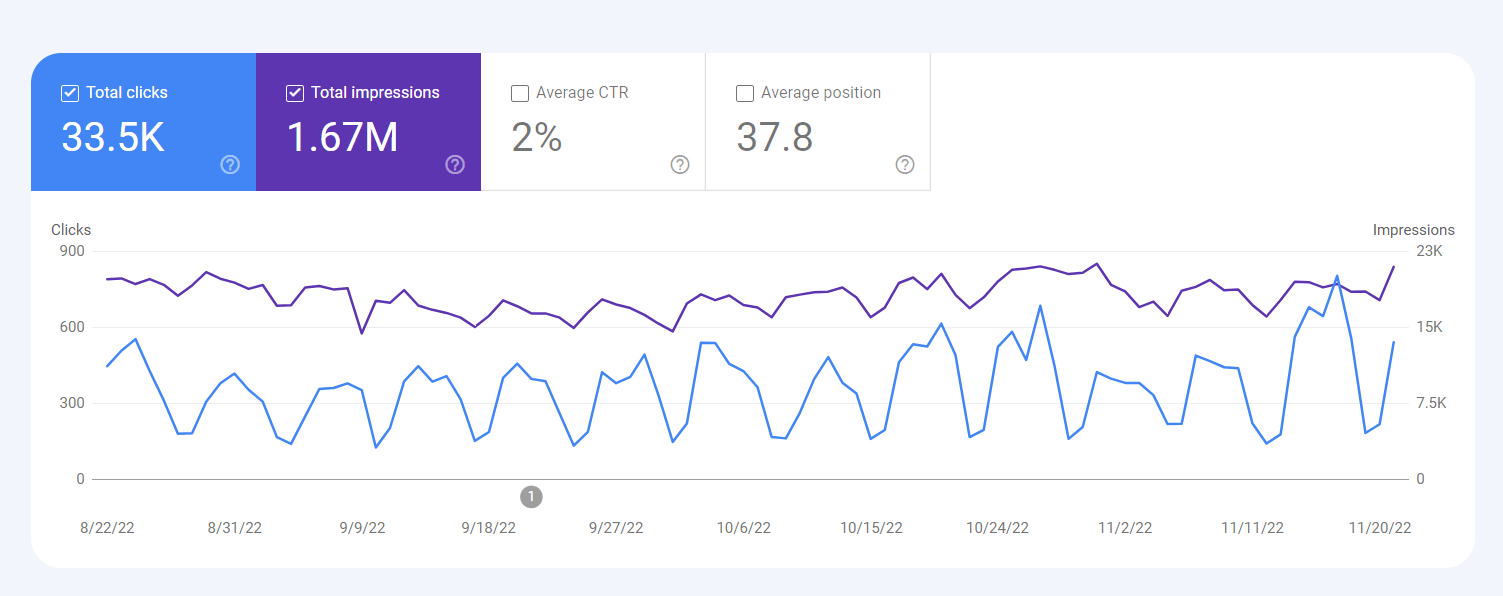
Increased Appointment Requests
Strategically placed calls-to-action and a simple, user-friendly booking system made it easier than ever for visitors to take the next step. Since launch, the clinic has seen a noticeable increase in appointment requests. Many new clients have shared that the clear service descriptions and the engaging “Weight Loss Tips for Beginners” video gave them the confidence to book a consultation. The website doesn’t just inform—it motivates visitors to act, turning interest into real, measurable results.
Streamlined Client Education
The bullet-pointed benefits and simplified medical explanations help prospective clients understand procedures like microneedling or dermal fillers without confusion. This clarity reduces pre-appointment questions and fosters smoother consultations.
Scalability for Future Growth
The Forever Young Wellness website was built on a flexible content management system, making it easy to grow alongside the clinic. Whether they’re launching a new treatment, sharing a patient success story, or adding fresh video content, the modular design ensures updates are quick and seamless. Best of all, every new element fits beautifully within the site’s polished, cohesive aesthetic—so the brand always feels consistent, no matter how it evolves.