
From Blueprint to Browser
The MC Innovation Website Story
Introduction
MC Innovation LLC is a trusted home improvement and general contracting company serving New Jersey homeowners with a commitment to quality, precision, and client satisfaction. Known for transforming houses into functional, beautiful living spaces—from kitchen remodels to full-scale renovations—MC Innovation has built its reputation on reliability and craftsmanship.
When they came to us, their goal was clear: create a website that not only showcases their wide range of services but also instills confidence in future clients. They needed a platform that was clean, easy to navigate, and reflective of their hands-on, professional approach.
In this case study, we’ll share how we brought that vision to life—designing a website that feels just as strong and welcoming as the homes MC Innovation renovates. From highlighting their projects to making it simple for clients to request estimates, every detail was built with purpose.
Project Overview & Objectives
MC Home Improvement LLC specializes in a range of services—from plumbing and electrical work to comprehensive kitchen and bathroom remodels. The company wanted to revamp its digital presence with a website that conveyed reliability and creativity. Our objectives included:
- 🚀 Enhancing visual appeal
- 🎯 Simplifying navigation
- 💡 Driving user engagement
The primary goals were to create a design that immediately captured attention, highlighted key services, and guided visitors toward taking action—whether that meant scheduling a consultation or exploring project galleries.
Design Strategy and Visual Identity
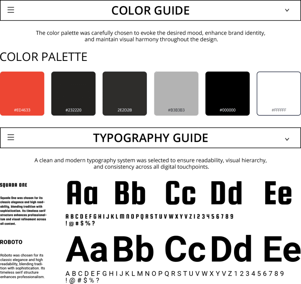
Creating a strong first impression was at the heart of our design strategy. We wanted the website to feel approachable for homeowners while still looking polished and professional for contractors and partners. Our goal was to strike that perfect balance—warm, welcoming, but also clean and modern. To do that, we focused on a few key design choices:
- Color Palette:
- Light grays and whites for a clean, neutral background
- Bold accent colors (orange/red) for CTAs and highlights
- Soft contrasting tones to emphasize key text
- Typography:
- Modern sans-serif fonts for headings and subheadings
- Highly legible body text for clarity on all devices
- Visual Cues:
- Minimalistic icons (e.g., 🔧 for plumbing, 🎨 for painting) that provide quick reference points
- Strategic use of bullet points and symbols to guide the reader
This thoughtful blend of design elements helped us articulate the company’s brand ethos—combining trust, innovation, and expertise into a cohesive visual narrative.
Key Design Elements
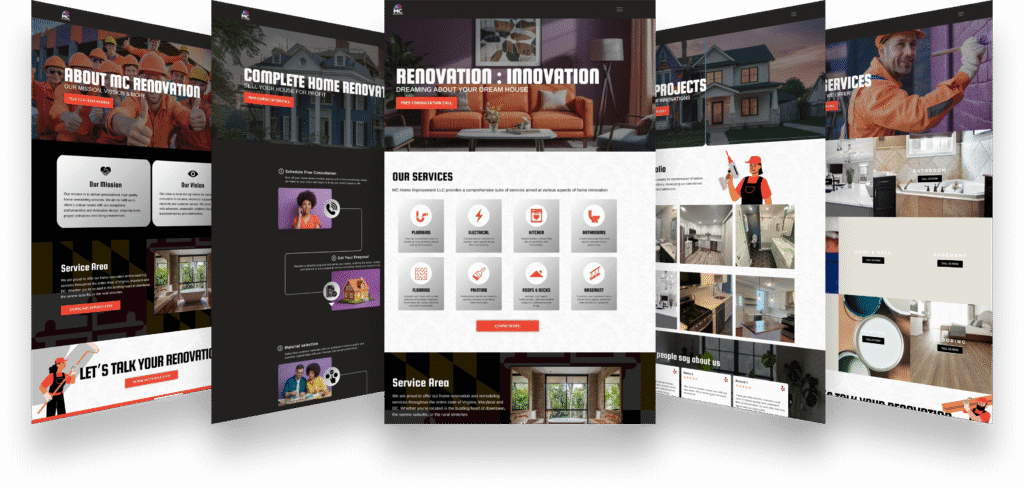
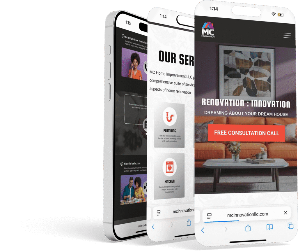
The Hero Section
The hero section is the digital front door of the website. We designed a full-width banner featuring a stylish, renovated living room that immediately connects with visitors. The following elements were integrated into this section:
- Compelling Imagery: A high-resolution photo that exemplifies modern home transformations
- Impactful Headline: “Renovation : Innovation” overlaid on the image
- Subheading: “Dreaming About Your Dream House” that personalizes the message
- Clear CTA: A prominently placed “Free Consultation Call” button in a bold accent color
In addition to these design elements, we added a few icons to punctuate the message and emphasize key benefits:
- 🔥 Bold Impact
- ✨ Modern Aesthetic
- 💡 Innovative Solutions

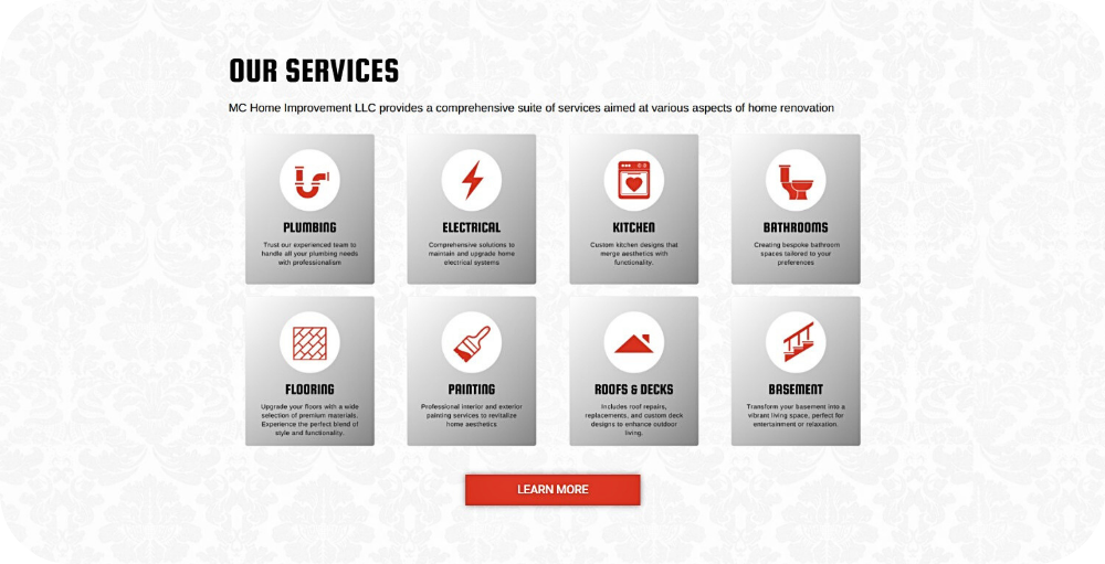
Service Overview
To showcase the broad range of services offered by MC Home Improvement LLC, we designed a grid-based layout. Each service was represented by a simple icon accompanied by a brief description. This design choice enabled visitors to quickly understand the company’s expertise. Key features include:
- Grid Layout: Cleanly organized service icons with concise descriptions
- Visual Anchors: Icons such as:
- 🔧 Plumbing
- ⚡ Electrical
- 🎨 Painting
- Quick Access: A “Learn More” button directs users to in-depth service pages
The integration of bullet points within the text helped break up information without disrupting the flow of narrative, allowing for both visual interest and clarity.
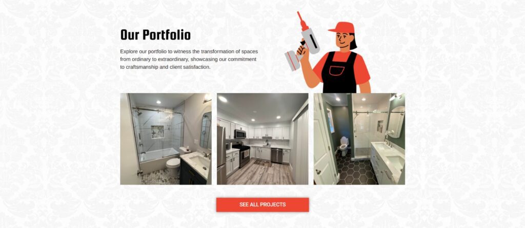
Portfolio and Project Highlights
Given that renovation is an inherently visual process, we dedicated a substantial portion of the website to a portfolio section. This gallery-style layout features before-and-after images that vividly demonstrate the transformation of spaces. The portfolio section includes:
- Curated Images: High-quality photos that capture the essence of each project
- Informative Captions: Short descriptions that provide context and highlight the transformation
- Engaging Visuals: Thoughtful white space to ensure each image stands out
To emphasize the narrative of transformation, we sprinkled in a few illustrative icons:
- 🏠 Home Transformation
- 🔨 Expert Craftsmanship
- ✨ Stunning Results
These icons serve as quick visual reminders of the quality and diversity of projects completed, encouraging visitors to explore further.
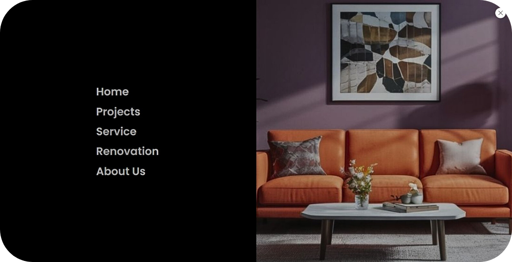
Innovative Navigation: The Side Menu
Departing from the traditional top-bar navigation, we implemented a sleek side menu that enhances both style and usability. The side menu remains hidden until engaged, ensuring that the homepage remains uncluttered while still offering easy access to all site sections. Features include:
- Clean Aesthetic: Preserves the visual focus on the hero section and main content
- Smooth Animation: A slide-out effect that delights users upon interaction
- Intuitive Structure: Clearly labeled links for Home, Services, Portfolio, Process, and Contact
By integrating subtle icons next to each menu item—such as 🏠 for Home and 📄 for Process—we not only improve usability but also add a layer of visual interest that complements the overall design.
Technical Implementation & Results
Our design was built on a responsive framework, ensuring that the website looks great and performs well across all devices. Key technical details include:
- Mobile Optimization:
- Responsive layout for desktops, tablets, and smartphones
- Collapsible side menu that maintains functionality on smaller screens
- Performance Enhancements:
- Compressed, high-resolution images for fast loading times
- Clean, efficient code that supports seamless navigation
- SEO Best Practices:
- Proper metadata and tagging to boost search engine visibility
- Strategic keyword integration that aligns with industry trends
The outcome of these technical efforts has been significant. Visitor engagement increased notably, with users spending more time exploring the site and interacting with multiple elements. The strategic placement of CTAs, such as the “Free Consultation Call” button, led to a measurable boost in lead generation. Our design enhancements contributed to:
- 🚀 Higher Conversion Rates
- 💡 Enhanced User Engagement
- 🔧 Streamlined Navigation
These results have not only improved the immediate user experience but have also positioned MC Home Improvement LLC for future growth and scalability.
Conclusion
The redesign of MC Home Improvement LLC’s website is a testament to the power of thoughtful, design-driven solutions. By balancing visual appeal with functional clarity, we created a platform that speaks to both the aesthetics and the needs of the modern homeowner. Our key strategies included:
- 🔥 A striking hero section that immediately captures attention
- ✨ Intuitive service overviews that quickly convey expertise
- 🏗️ A transparent, step-by-step process that builds trust